Range-Time Parameter Plots
Range-time parameter plots (also known as range-time intensity (RTI) plots) are time series of a radar-measured parameter at all range-gates along a specific beam. They are the most common way to look at data from a single radar.
Basic RTP
The general syntax for plot_range_time is:
plot_range_time(fitacf_data, options)
where fitacf_data is the data read in using the read functions, and the options are several python parameters used to control how the plot looks.
First, make sure pyDARN and matplotlib are imported, then read in the fitacf file with the data you wish to plot:
import matplotlib.pyplot as plt
import pydarn

fitacf_file = "20190831.C0.cly.fitacf"
fitacf_data, _ = pydarn.read_fitacf(fitacf_file)
You can choose one of four data products to plot:
| Data product | String name |
|---|---|
| Line of sight velocity (m/s) | v |
| Spectral width (m/s) | w_l |
| Elevation angle (degrees) | elv |
| Power (dB) | p_l |
which is chosen by adding:
parameter='String name'
as an option. The default if left blank is v.
To specify which beam to look at, add the option:
beam='beam_number'
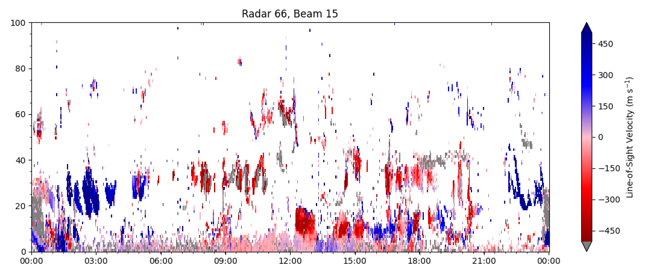
Here is an example of velocity v data from the first record (fitacf_data[0]) of some Clyde River FITACF data:
import matplotlib.pyplot as plt
import pydarn

fitacf_file = "20190831.C0.cly.fitacf"
fitacf_data, _ = pydarn.read_fitacf(fitacf_file)

pydarn.RTP.plot_range_time(fitacf_data, beam_num=fitacf_data[0]['bmnum'], range_estimation=pydarn.RangeEstimation.RANGE_GATE)
plt.title("Radar {:d}, Beam {:d}".format(fitacf_data[0]['stid'], fitacf_data[0]['bmnum']))

plt.show()
which produces:
fitacf_data[0]['bmnum'] is used to extract the beam number of the first (0th) record from the data dictionary, whilst fitacf_data[0]['stid'] gives the station id (which is 66 for Clyde River).
Notice that the velocity scale on the right is a bit larger than we need, and also ground scatter isn't coloured grey by default. Showing the dates on the x axis is also a bit redundant, because it's data from a single day. Below, there are some additional parameters you can set to customise the plot and more.
In addition, above we use range_estimation=pydarn.RangeEstimation.RANGE_GATE to set the y-axis to plot in range gates.
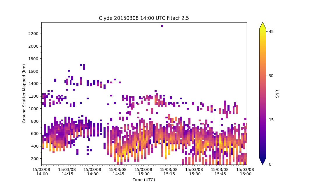
Below we use Ground-Scatter Mapped Range instead to plot power:
pydarn.RTP.plot_range_time(fitacf_data, beam_num=3, parameter='p_l',
                           range_estimation=pydarn.RangeEstimation.GSMR,
                           colorbar_label='SNR')
plt.title("Clyde 20150308 14:00 UTC Fitacf 2.5")
plt.ylabel('Ground Scatter Mapped (km)')
plt.xlabel('Time (UTC)')
plt.show()
Additional options
| Parameter | Action |
|---|---|
| start_time=(datetime object) | Control the start time of the plot |
| end_time=(datetime object) | Control the end time of the plot |
| channel=(int or string) | Choose which channel to plot, default is 'all' |
| groundscatter=(bool) | True or false to showing ground scatter as grey |
| date_fmt=(string) | How the x-tick labels look, default is ('%y/%m/%d\n %H:%M') |
| zmin=(int) | Minimum data value to be plotted |
| zmax=(int) | Maximum data value to be plotted |
| range_estimation=(RangeEstimation) | Estimation of the distance for the radar to use for the y-axis (See Ranges, Coords and Projs) |
| coords=(Coords) | Used in conjunction with range_estimation, converts the y-axis to a coordinate |
| lat_or_lon=(str) | In conjunction with coords, choose if you would like the latitude ('lat') or longitude ('lon') |
| colorbar=(plt.colorbar) | If you would like a different colorbar than the default |
| colorbar_label=(str) | Set the label fo the colorbar |
| nightshade=(bool) | Turn on shading of the night side of the terminator |
| background=(str) | Colour of the background of the plot, default 'w' (white) |
| ymin=(int) | Sets the minimum y-axis value, default to use max from data |
| ymax=(int) | Sets the maximum y-axis value, dafault uses 0 or minimum range estimate |
| yspacing=(int) | Sets default spacing between ticks on the y-axis, defaults depend on range estimate |
| cmap=(matplotlib.colormap or str) | Matplotlib colour map optiont to change colour map in plot |
| round_start=(bool) | Option to round the start time to line up start with a tick label |
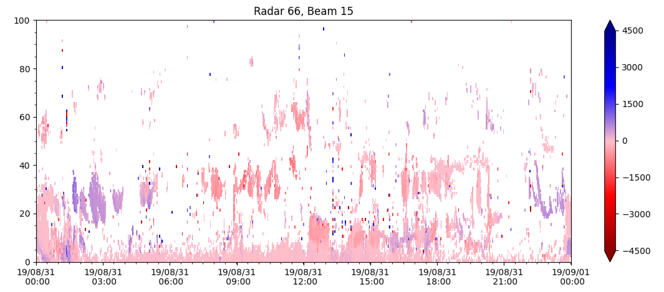
For instance, code for a velocity RTP showing the same beam of Clyde river radar as above, but with ground scatter plotted in grey, date format as hh:mm, custom min and max values and a colour bar label could look something like:
pydarn.RTP.plot_range_time(fitacf_data, beam_num=fitacf_data[0]['bmnum'], groundscatter=True,
                           zmax=500, zmin=-500, date_fmt='%H:%M',
                           colorbar_label='Line-of-Sight Velocity (m s$^{-1}$)',
                           range_estimation=pydarn.RangeEstimation.RANGE_GATE)
which outputs:
and looks much more useful!
Plotting:
pydarn.RTP.plot_range_time(fitacf_data, beam_num=fitacf_data[0]['bmnum'], groundscatter=True,
                           zmax=500, zmin=-500, date_fmt='%H:%M',
                           colorbar_label='Line-of-Sight Velocity (m s$^{-1}$)',
                           range_estimation=pydarn.RangeEstimation.SLANT_RANGE,
                           coords=pydarn.Coords.GEOGRAPHIC, lat_or_lon='lat')
will produce the above plot with geographic latitude along the y-axis instead.
Plotting with a custom color map
Because the default parameter plotted is line-of-sight velocity, there is also a special red-blue colour map set as default (as seen above) which is only meant for velocity RTP's.
To change the colormap, use the 'cmap' parameter with the string name of a matplotlib color map (found here). For example, plotting the power along the beam above using the colormap 'viridis':
pydarn.RTP.plot_range_time(fitacf_data, beam_num=7, parameter='p_l', zmax=50,
                           zmin=0, date_fmt='%H%M', colorbar_label='Power (dB)',
                           range_estimation=pydarn.RangeEstimation.RANGE_GATE,
                           cmap='viridis')
produces:
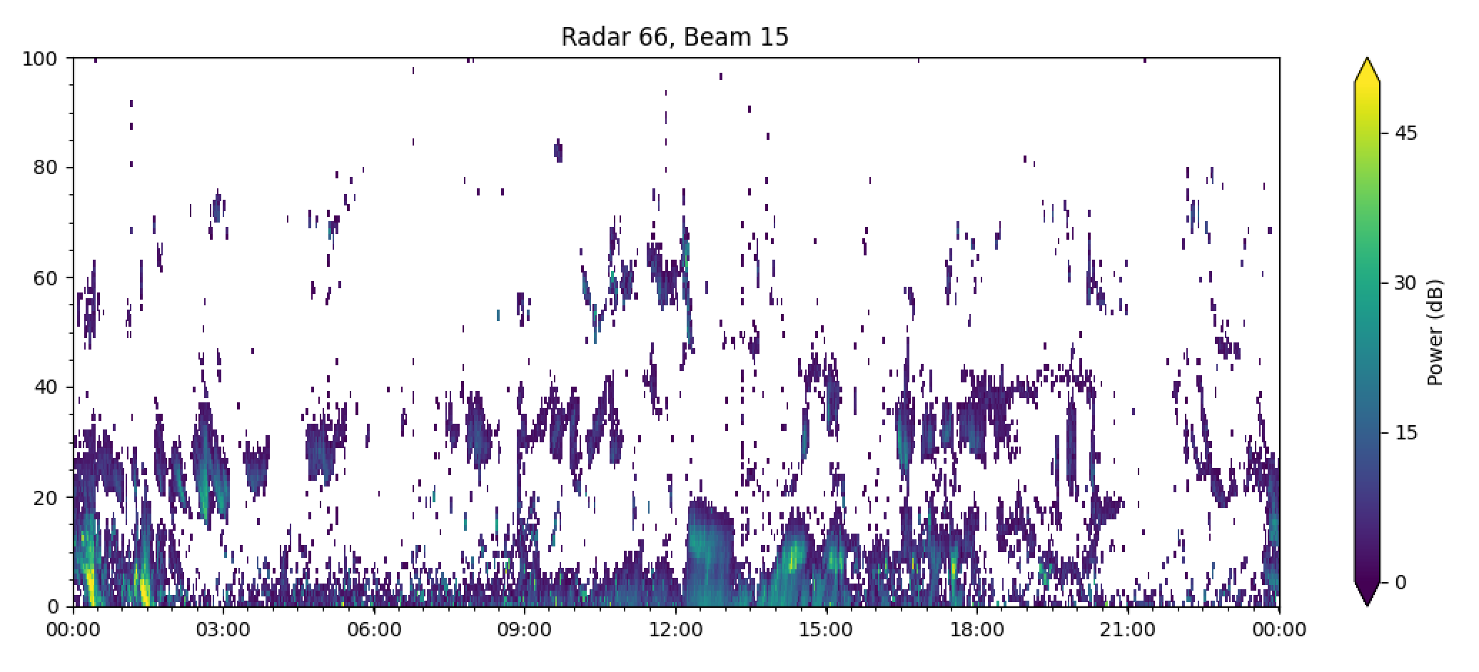
Feel free to choose a color map which is palatable for your needs, except jet.
Warning
If the data contains -inf or inf a warning will be presented and the following parameters will be default to the scale:
| Parameter | Name | Scale |
|---|---|---|
v |
velocity | (-200, 200) |
p_l |
Signal to Noise | (0, 45) |
w_l |
Spectral Width | (0, 250) |
elv |
Elevation | (0, 45) |
Example:
import pydarn
import pydarnio
import matplotlib.pyplot as plt

fitacf_file = 'data/20161014.1401.00.rkn.lmfit2'
fitacf_data, _ = pydarn.read_fitacf(fitacf_file)
pydarn.RTP.plot_range_time(fitacf_data, beam_num=7, parameter='p_l')
plt.show()
console output
UserWarning: Warning: zmin is -inf, set zmin to 0. You can set zmin and zmax in the functions options
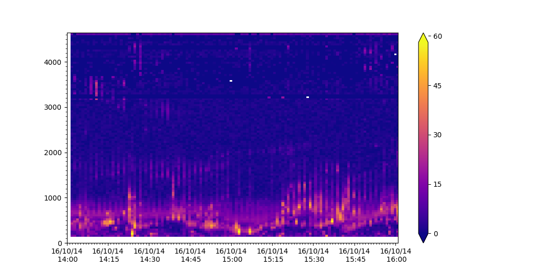
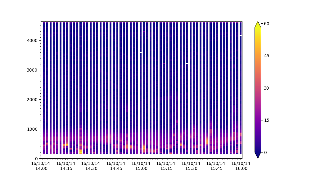
Warning
When using filters on data you may remove all data or some data which causes a NoDataError or stripping in the plot
Example of data showing striping due to removal of some frequencies:
filts = {'min_scalar_filter':{'tfreq': 11000}}
pydarn.RTP.plot_range_time(fitacf_data, beam_num=7, parameter='p_l',
                           filter_settings=filts)
plt.show()
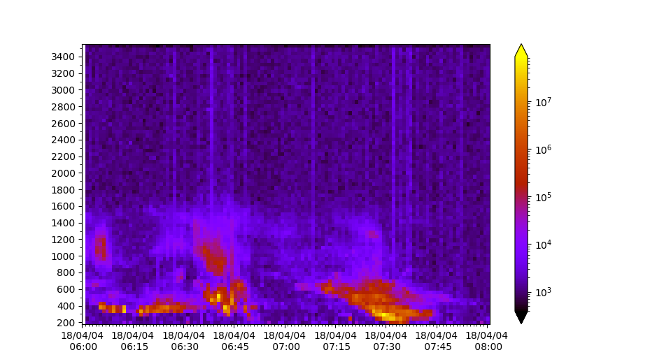
Plotting Lag-0
Range-time plots also allow users to plot pwr0 parameters in RAWACF files:
import pydarn
import matplotlib.pyplot as plt
from matplotlib import colors

rawacf_file = './data/20180404.0601.00.inv.rawacf'
rawacf_data, _ = pydarn.read_dmap(rawacf_file)
lognorm=colors.LogNorm

pydarn.RTP.plot_range_time(rawacf_data, beam_num=0, parameter='pwr0',
                           norm=lognorm, cmap='gnuplot')